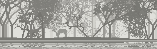
react(); by Synthestruct Audioreactive + interactive dance visualizer created using the Kinect + Processing
1000 Followers
This procedural generation blog has passed 1000 followers, which is really cool for a project that I started so I could talk to myself. Thanks for listening!
(I also like Synthestruct’s audio visualizationswith fluids. Which I think is really cool and right on the edge of on-topic for the blog, so I’m glad I have an excuse to talk about it.)
Just talking about one of you barely scratches the surface: there are a lot more interesting projects that you readers have done. I wish I had time to highlight them all.
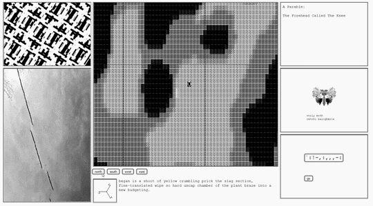
Loren Schmidt’s entry for NaNoGenMo 2015, this computer-generated art-book/novel explores three thematically linked approaches:
I think my favorite part is “forgetting the moon”: a step by step depiction of a machine literally forgetting what the moon looks like.
The use of failed or flawed processes as narrative is an underutilized thing. Computational design, and game design in particular, often involves creating a relationship between a process and a meaning (see Brenda Laurel’s Computers as Theater). But here, the message is explicitly created by the failures of the process.
The algorithm forgets because it is incapable of remembering: a very human failure. Sometimes, even a precious memory can be as forgotten as the face of the moon.
The use of a computational process as direct narrative also reminds me of
thricedotted’s The Seeker. While very different novels, both of them use the inner thoughts of a machine as their structure.
The “unknown stars” are the reverse of forgetting. It’s remembering too much. It creates something new by finding patterns and making them real in a kind of Tlönianesque generation.
This, I feel, touches at a central idea of procedural generation: we can’t create something entirely new, something without a cause. But the generated things can take on a life of their own, making themselves more real. The act of cartography, of charting known spaces, becomes a creative act. A map is not the thing it depicts, but it is itself a new thing.
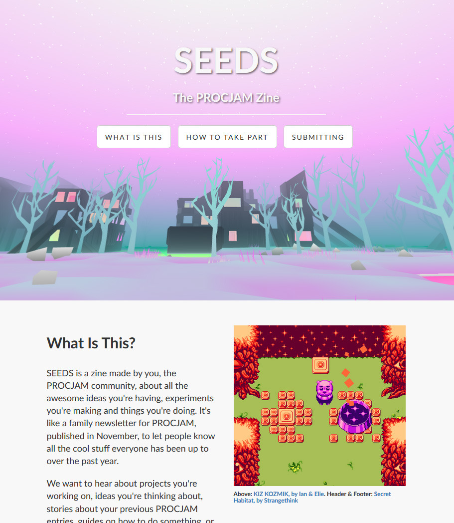
For the upcoming ProcJam 2016, the ProcJam team is putting together a zine. And they want your submissions!
They’re looking for a wide variety of stuff, so go ahead and submit yours. Not just projects you’ve made or want to make, but also things like questions you can’t answer or ideas that inspired you. If you don’t want to write, an art spread will do nicely.
I like seeing the ProcJam community grow, and here’s your opportunity to participate. Let’s make stuff that makes stuff!
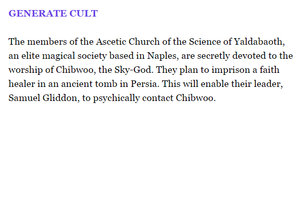
I can think of numerous applications for a procedural cult generator. Maybe you need a group to summon a procedurally generated demon, or maybe your Trail of Cthulhu campaign could use help with plot inspiration.
While it’s not the only source of generatedcults, what’s unique about this one is that it’s implemented in Twine. It’s a good reminder that you don’t need fancy technology or elite coding skills to make interesting procedural generation projects. Start with the tools you know how to use. Learn new things as you need them. Make stuff.
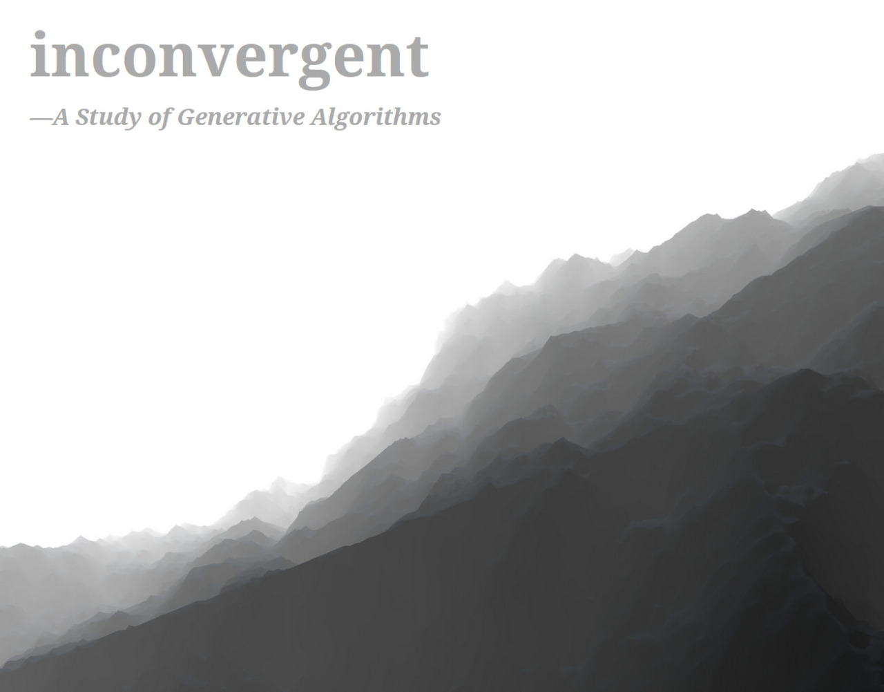
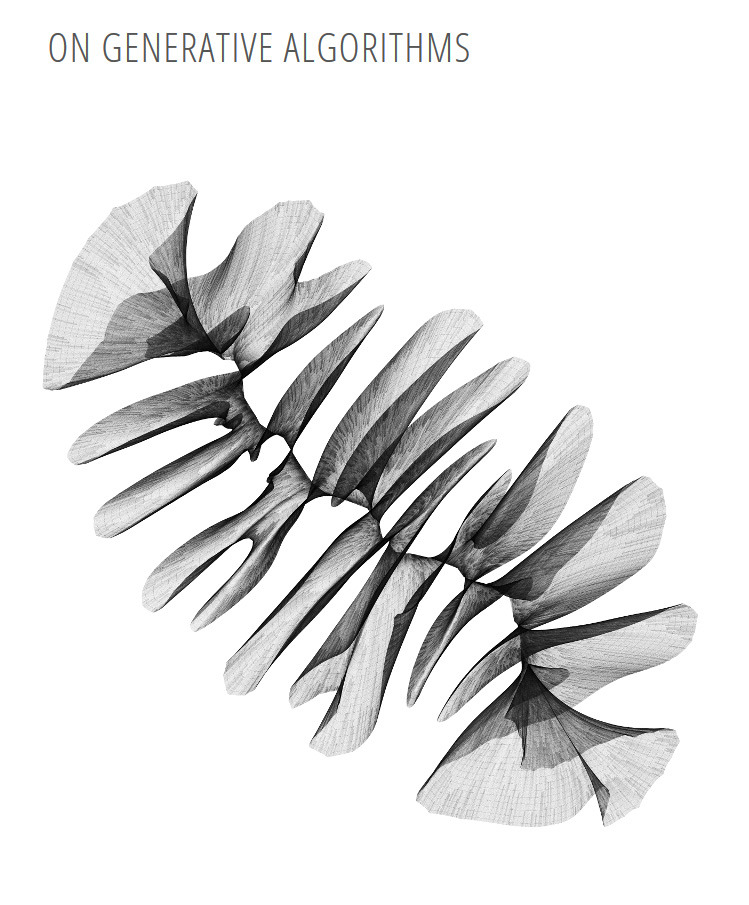
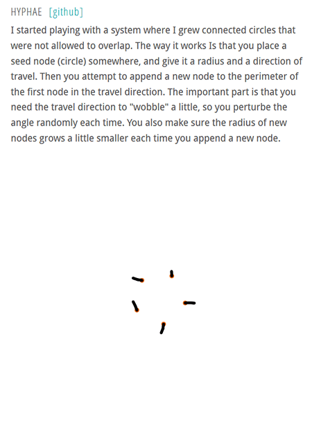
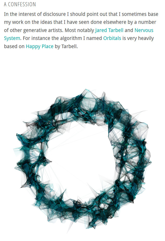
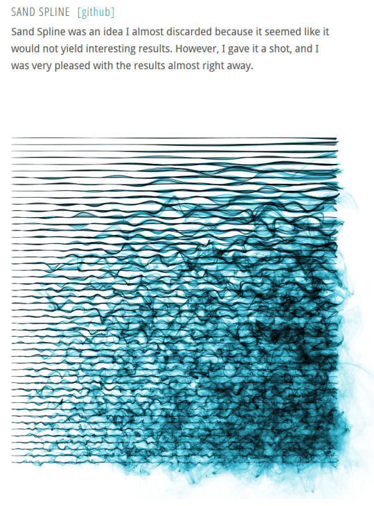
The ongoing generative art projects of Anders Hoff are interesting not just because they’re beautiful example of generative art, but also because of the detailed explanations of their processes and how they were constructed.
Many of Anders’ projects are made with output to a plotter in mind. I suspect that having the concrete limitations that provides has helpfully narrowed the focus.
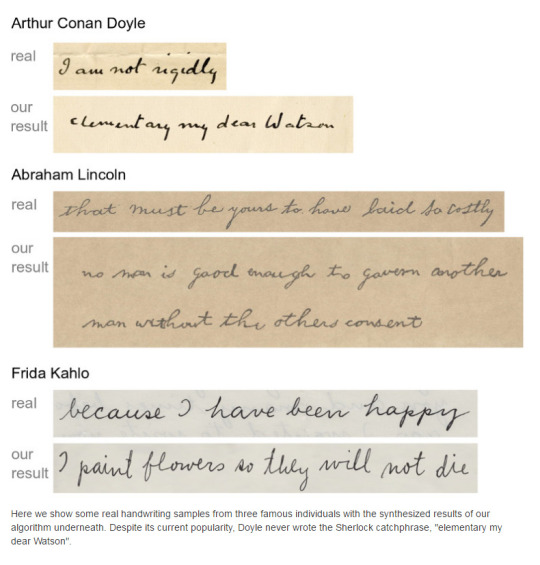
Tom S.F. Haines, Oisin Mac Aodha, and Gabriel J. Brostow have built a system to imitate handwritten messages. It takes a handwriting sample, and outputs a result that looks convincingly like the handwriting of the original writer.
This is really cool, because there’s a bunch of fun artistic things you can do with handwritten text. Imagine playing a biographical game about Abraham Lincoln, with the text in Lincoln’s own handwriting.
It’s also really creepy because it further transgresses our expectations for what is real. While technical limitations make it hard to use for original-document forgeries–inkjet printers turn out to be terrible for imitating even cheap pens–much of the time we’re only dealing with an image of an image anyway. Unless you’re a scholar working with primary sources, you’ve probably gotten used to treating an image of a thing as the thing itself.
Not perfectly, of course. You know what the Mona Lisa looks like, but you’d probably agree that seeing it in person is still slightly different. But there’s technology that can alter images, and has been since the invention of photography. For less well known images, how certain are you that you know what the original looks like?
(For that matter, given the crush of people who try to observe the Mona Lisa through its bulletproof glass, how many of them have really gotten a good look at it lately?)
Handwriting has photography’s associations with authenticity, but it also has a veneer of pre-industrial non-reproducibility. When handwritten greeting cards can be mass produced and customized exactly to the recipient, will we still feel the same way about handwriting?
Just because something is infinitely varied doesn’t mean that it’s infinitely unique.
Fractals can be extended forever, but many of them are homogeneous: roughly the same everywhere. Real-world fractal phenomenon are more often heterogenous, such as Ken Musgrave’s example of a mountain surrounded by foothills. Similar, but different.
Sometimes this depends on the scale you’re viewing it at. An aesthetic rule-of-thumb is to consider how something looks when you get really close or really far. Pull back far enough with a Minecraft world map, for example, and the complex patchwork of biomes will fade into noise.
This works fine for Minecraft because you’ll never directly experience the map at that level, so additional work on lacunarity across more octaves would mean less interesting play on the block-level. Minecraft used to have much larger oceans: the biome update deliberately reduced them because they were empty and boring. Minecraft is heterogeneous enough over the scale that the developers and players care about.
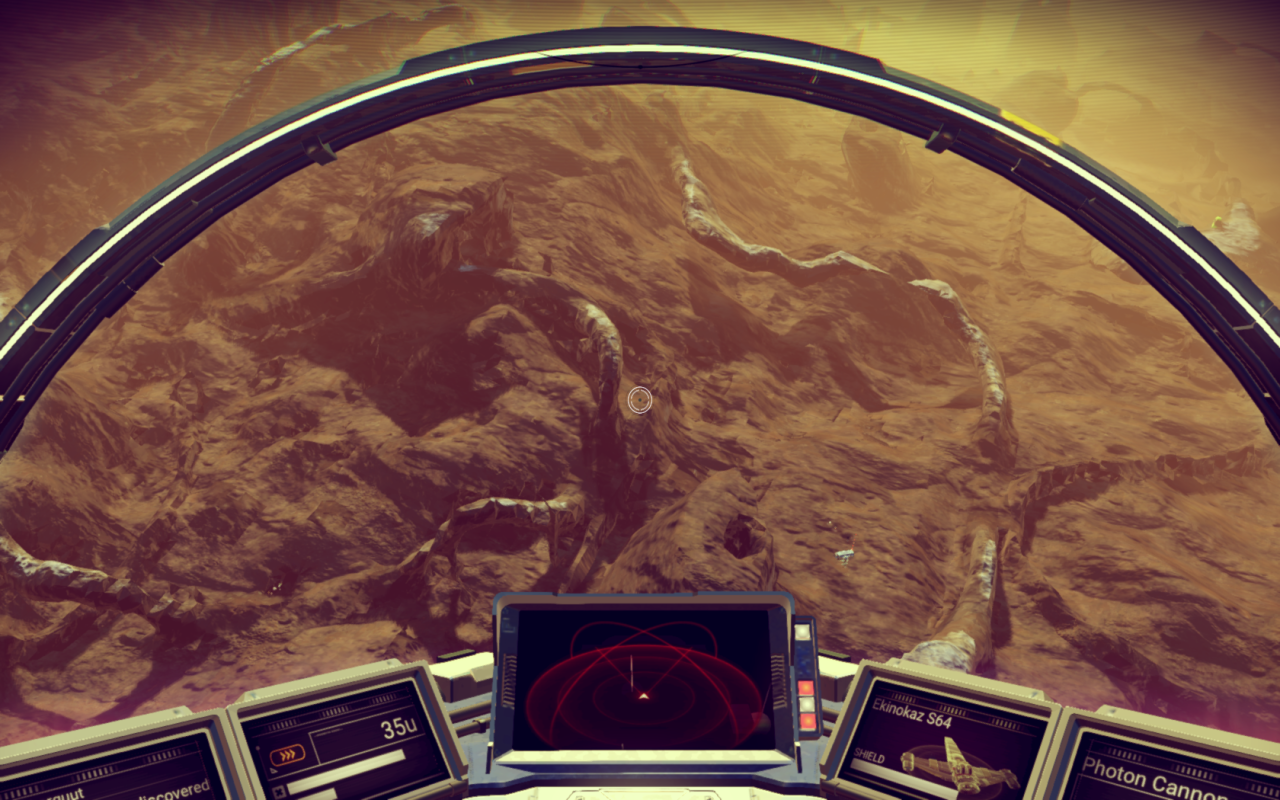
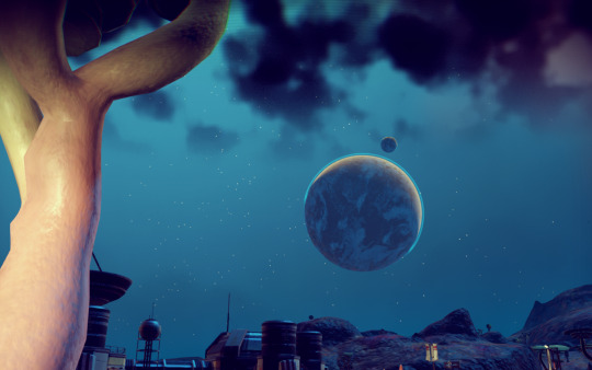
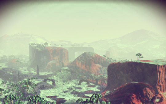
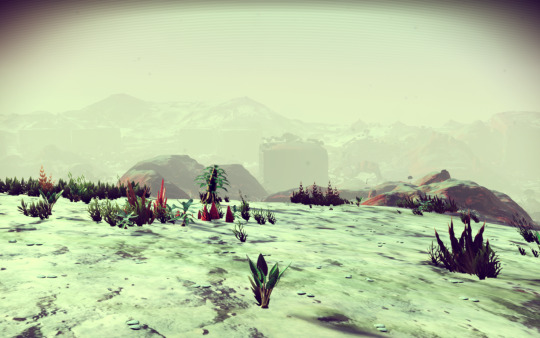
For No Man’s Sky, each planet as a whole is deliberately homogeneous. I’m not entirely sure that I agree with that as a design choice, but it is integrated with the rest of the game.
While the localized terrain for each planet is heterogenous while you’re walking around, every place you visit on the planet is roughly similar. There will be a few localized differences, as the parameters vary, but the general composition will feel familiar.
This does facilitate the gameplay: finding every species or visiting the locations you want would be much, much harder if they were spread out over widely separate regions of the planet. This extends to the more abstract characteristics as well. Each area on the planet has a roughly similar mix of points-of-interest, similar basic resources, and buildings that look the same.
The result is an odd reversal of the usual feeling of hitting the wall of the artificial game-space. Rather than using a tiny area to stand in for an entire planet, as in Mass Effect, the whole planet is instead fractally different but effectively recurring. There are no walls, but the design encourages you to exhaust the current sights and move on to the next place.
So far as I’ve explored, the major functional contrasts between planets are the environmental hazards, the ease of access to minerals, the presence of rare items, and some other details like that. The terrain itself has less of an effect. There may be more extreme contrasts deeper into the game, but so far the basic interactions are predictable.
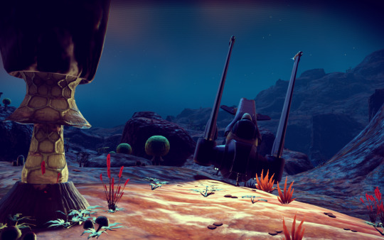
The terrain matters aesthetically, particularly when you want to photograph it, but otherwise it only impinges itself on the player’s experience when combined with other hazards: a building partially submerged in radioactive water, having to take shelter in a cave to wait out a sudden violent storm, getting cornered under a ledge by an aggressive animal. The player’s extreme mobility plays into this, of course: even a jagged mountain is easier to cross when you can jet off in your spaceship.
Contrast is an important aesthetic principle. The most obvious kind of contrast is a difference in light and dark, such as the striking chiaroscuro in Caravaggio’s paintings. But there’s also contrast of other aspects, like forms, position, or texture. One form of contrast that’s borrowed from architecture and is often relevant to level designers is a contrast of spaces. For example: a tight hallway leading to a wide open space. Similar to the effect of entering a cathedral, the contrast between the space emphasizes the difference, making the larger space feel larger and the tighter space feel tighter. (Dark Souls uses this frequently, even within areas. The Undead Burg is an early, masterful example.)
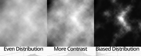
Procedural generation has its own forms of contrast, in addition to the ones borrowed from architecture. There’s simple forms of contrast, like having a terrain height map use the whole range of values–though because asymmetry is more aesthetically arresting, it’s even more striking if the height map has a few very high points rising above a plain of low points.
Which is another form of contrast: call it contrast of frequency. Instead of using evenly distributed white noise, consider other probability distributions. An exponential falloff in a histogram stands out more than an even gradient.
While there is often great contrast between the different planets in No Man’s Sky, the transition through space acts as a palate cleanser. Each bite is a separate taste.
Which means there’s no room for juxtaposition, another kind of aesthetic principle. I can put my photos of the planets side-by-side, but in-game there will be at least several minutes between each different view.
As was pointed out to me on twitter, this also means that the experience of rounding a corner and seeing something new is less likely. If this side of the hill is about as same as that side of the hill, why go over it?
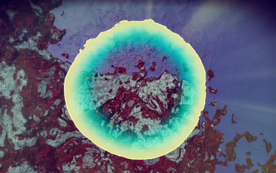
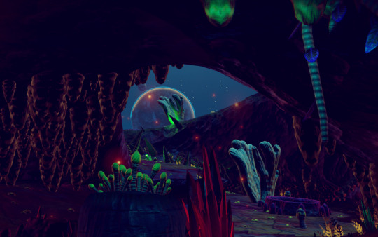
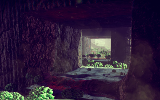
The one place the game does pull off transitions well is with the caves, which probably deserve a discussion all by themselves. Finding an unexpected exit to a cave you’re exploring and getting a glimpse of the outside world is an under-appreciated pleasure, particularly since No Man’s Sky’s caves are fundamentally uncaring of human needs or interests.
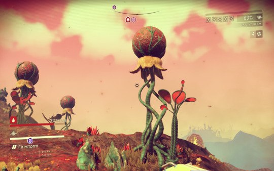
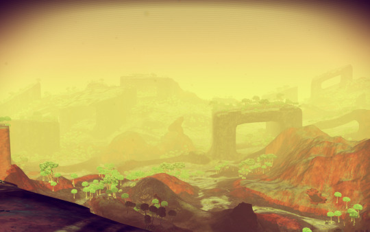
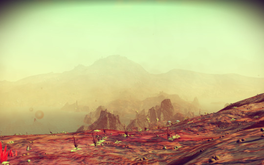
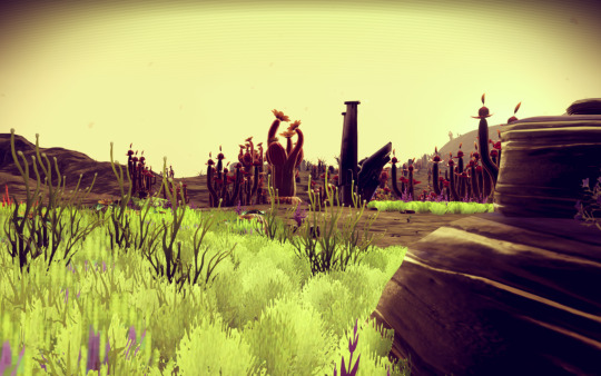
A big thing that No Man’s Sky succeeded at is in evoking emotional response with terrain. When it manages to pull off creating an amazing vista it can be breathtaking. And it is to Hello Games’ credit that it succeeds as often as it does.
Which is why I’ve found it a pity that I’ve yet to encounter any planet that evokes the emotions I felt while standing on the edge of the Guadalupe Mountains at Carlsbad Caverns, looking out across the vast expanse of the plains to the east. (And that photo doesn’t do justice to actually being there.)
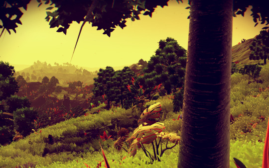
Instead, the variation in No Man’s Sky feels a bit like the parts of England that I’ve visited. A lot of local variation, but fewer empty horizons or impossible heights. No extreme contrasts, like Kilimanjaro or Fuji. And most of the variations aren’t things you can see from space, so no Valles Marineris or Mare Ibrium, either.
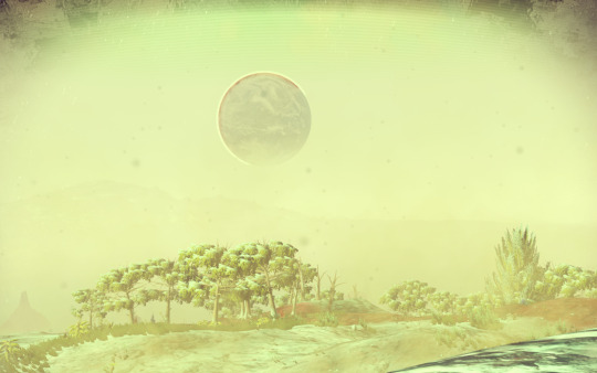
Which is not to say that striking views are absent. The planet generator makes good use of the contrasts that it does have:
Although, despite most likely being objectively bigger in geometric units, they feel smaller to me than the extreme contrasts of Minecraft’s Amplified biomes, whose near-impassible cliffs feel like they loom impossibly high over the flatter-by-contrast plains. (Granted, that’s partially a function of the different mode of travel. The problem with a spaceship is that it can make even the biggest planetary features feel small.)
There are some pretty big mountains…
…but there’s no flat plains that I’ve encountered yet, so I think it’s harder to appreciate them.
Like most artistic principles, deliberately contradicting contrast is another way to create visual interest. Sometimes lack of contrast where we’d expect to find it becomes its own form of contrast. Some of the most striking places on the planet are that way because they contradict our expectations. If everywhere is hills, it’s hard to appreciate the hills.
Still, the locally homogeneous nature of the planets doesn’t detract from the fact that there is a lot of aesthetic variation across all of the planets. I keep saying that I haven’t encountered something yet, because despite the fact that I’m beginning to grasp the overall patterns, I’ve yet to run out of interesting variations. I haven’t seen enough of the game to get a good handle on the expressive range of the terrain generation. So for all I know there is a planet that’s just a vast salt plain, and I just haven’t encountered it yet.
I would have personally preferred it if the other gameplay systems embraced the same principles as the incomprehensibly vast collection of planets. Though that’s a topic for another day.
Of course, there are advantages to having some constrained mechanics. The game is much more approachable and easier to balance with a predictable progression. And developing enough depth and variation in every generator to make every planet into its own microcosm would be a much larger investment, with a very different game design.
The good news, if you’re making a planet-exploring Noctis-like of your own, is that this gives you an easy axis to differentiate yourself from No Man’s Sky. Design a planet generator that has a focus on contrast, heterogeneity, or just making a handful of planets as interesting as possible, and you’ll end up with something very different.
Michael Cook just posted something that I think is rather significant to the conversation around procedural generation: how we talk about it.
This is an important topic for me: one of my goals for this blog is to show people what I think is exciting about procedural generation, and to give them some insight into how it actually works. Grand claims about infinity can confuse more than they help, even though infinity is an easy way to start explaining what generative processes are. I’m on the constant look-out for terms to describe parts of procedural generation, such as order, flexibility, opulent, and mushroom.
The post I was working on for today (and will instead be posted tomorrow) was attempting to explain some new vocabulary. It talks about two terms I think are relevant to procedural generation that I haven’t seen discussed much: contrast and homogeneity.
I think Michael Cook’s article is an important one, and I look forward to seeing even more vocabulary develop in and around procedural generation.
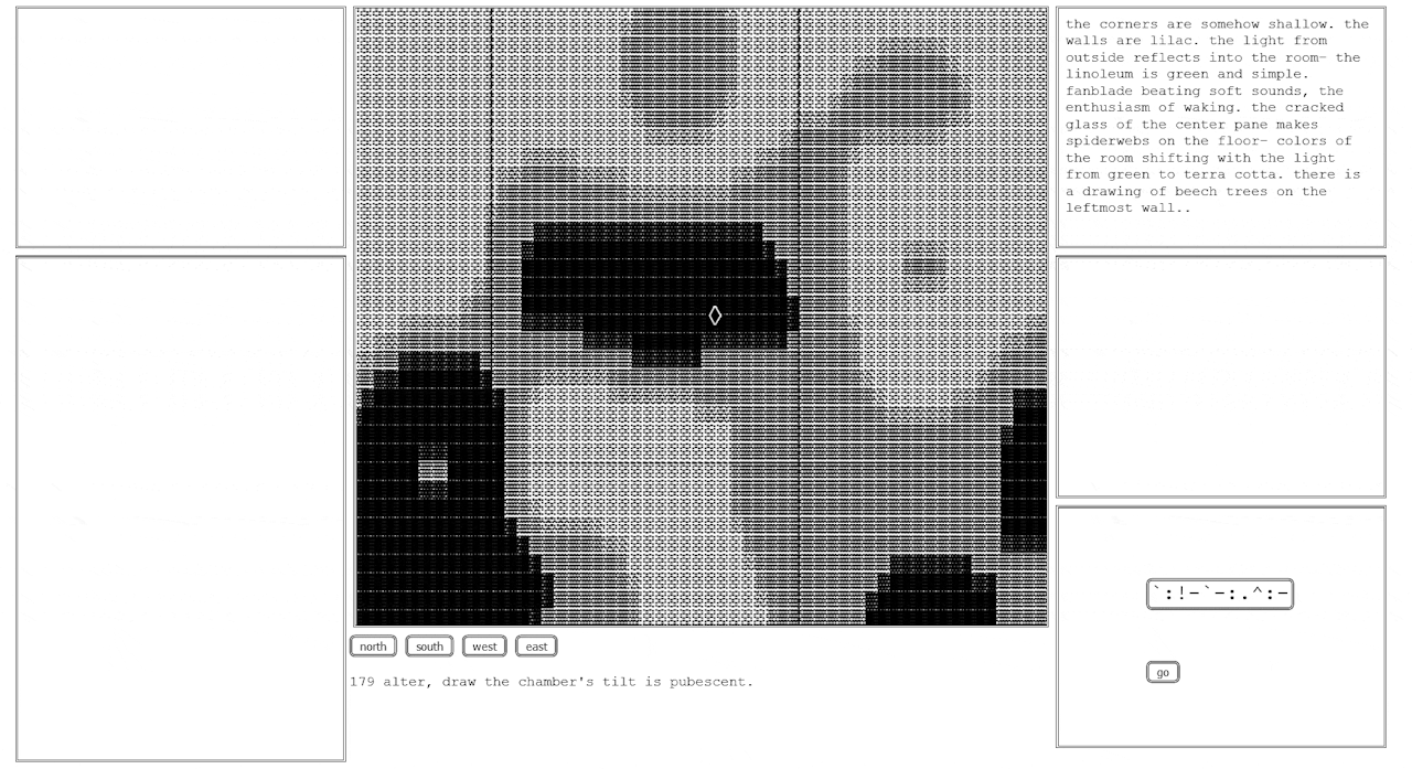
An important procgen project was released just a few days ago: the long-awaited second volume of inflorescence.city.
Loren Schmidt and everest pipkin have created a follow-up to volume 1. Volume 2 is more interactive, though also more abstract. It draws from some of their previous projects: I can see traces of moth generation, no people, and cloud translation. But there’s also audio, parables, symbols, and cardinal directions.
Volume 1 is still available for perusal from the same site. I’m looking forward to seeing what they come up with next.