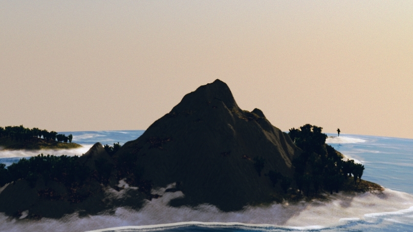
Neural Doodle texture synthesis (in a chart)
I ran an experiment with the neural-doodle texture synthesis I’ve talked about previously, taking five seed images I created in Tilemancer and running them against a lot of different style images. You can see the results in the chart above.
What interests me in these outcomes is that the results aren’t just different from the style image, but it some cases wildly different–while still being, for the most part, plausible images. If you didn’t know which image was the original, could you tell?
(Here’s the 19MB full-sized PNG chart)
Mimicking the Content

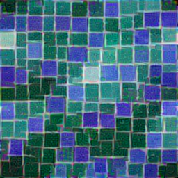
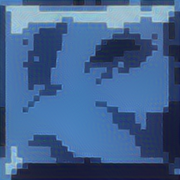
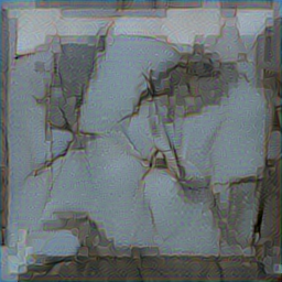
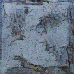
The settings in the chart were geared towards creating a result that resembled the style image. I also did some tests for things closer to the content image. Here’s the purple rocks tile:
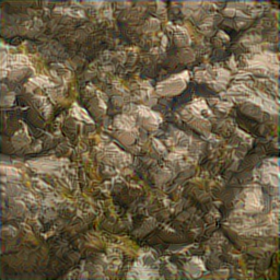
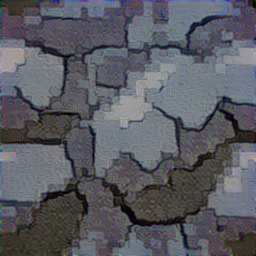
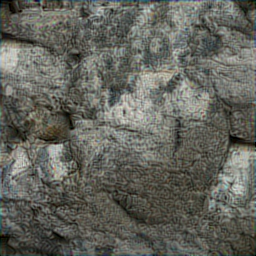
And here’s some based on the floor tile:
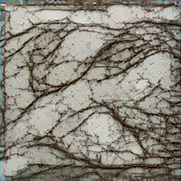
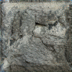
This technology is advancing incredibly rapidly: in the short time since I did these, there have already been some promising new projects released, and the neural-doodle algorithm has had some significant improvements, like the addition of rendering larger images in segments.
The next six months or so are going to be a very interesting time.
