


Elite: Dangerous - Stations
Something that’s a bit less noticeable than the procedurally generated planets is that Elite: Dangerous also has procedurally generated space stations.
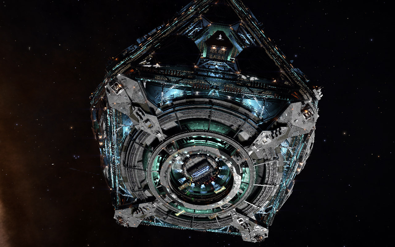
The big stations come in three or so varieties. The cuboctahedron-shaped Coriolis starports–which resemble the stations from the original Elite–tend to have very similar exteriors, except for the different lighting colors and the rare exterior arms.
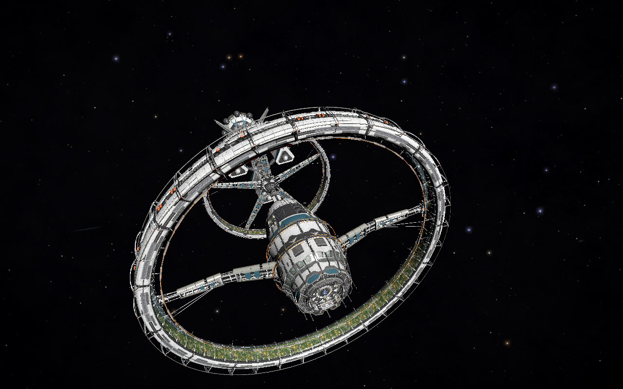
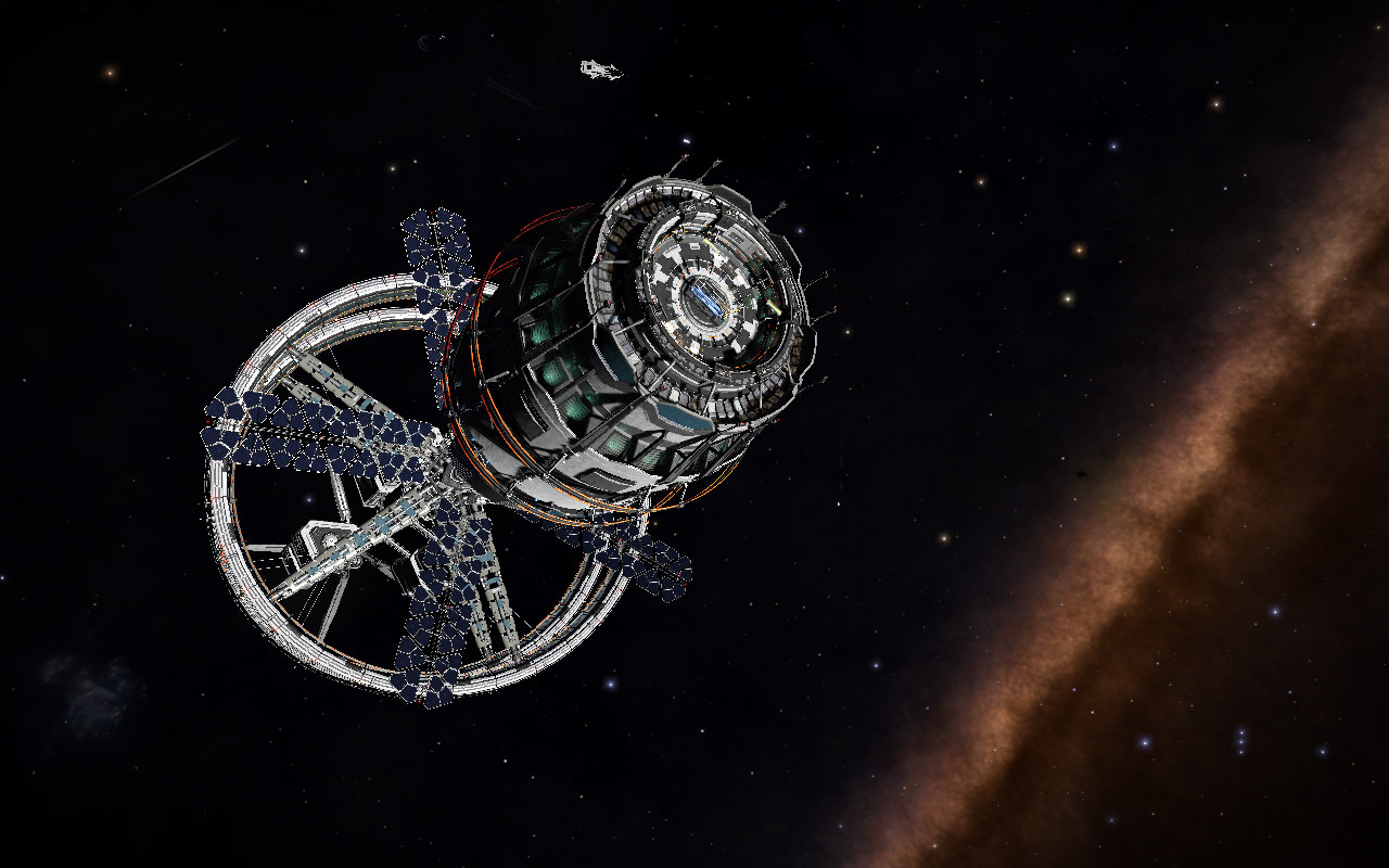
More distinctive are the Orbis stations, cylindrical constructions arranged along a central axis. The stations are clearly built from modular parts and there’s a huge variety of different configurations.
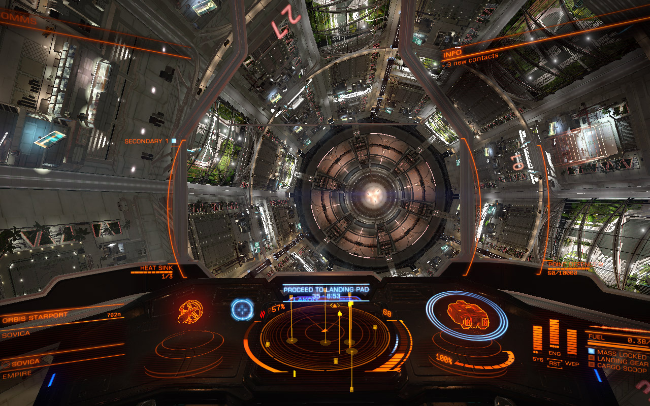
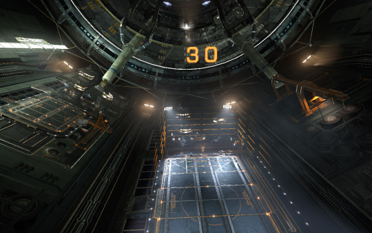
Unfortunately, most players aren’t going to notice this difference, because they mostly just interact with the business end of the stations, which pretty much all look exactly like this:
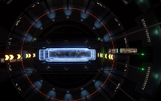
All that detail gets hidden because the major part the players interact with is mostly identical. Now, for all I know, there may be some variation that I’ve overlooked. (The motto painted above the docking slot does vary, for one.) But if there is, it doesn’t significantly affect the silhouette of the part of the station that the players spend the most time interacting with.
Human visual perception unconsciously responds differently to different cues. When we’re sensing differences or change, we look for color, motion, shape, and so on. In the case of these space stations, the shape of the docking area is similar enough that the different colors of lights don’t make a huge difference. Humans are relatively good at seeing familiar objects as the same under different lighting conditions, after all.
That’s one reason why silhouettes are important in animation and drawing: you want to ensure that a character and pose is recognizable in silhouette to make the visual perception work with you rather than against you.
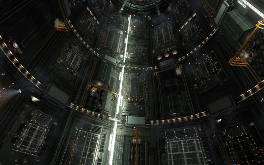
This goes double for the interiors, which are nearly all very similar, I suspect because it’s such a big part of the game’s interaction that it makes it tricky to introduce too much variety without a lot of extra testing. As it stands, I’ve never seen any bugs in the core docking mechanic, and I imagine that you’d need to put in a lot of work to guarantee that across the board with more varied interiors.
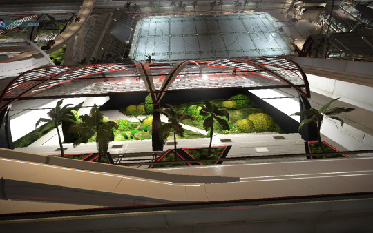
There is one kind of interior that is very different: some stations have a pink-tinged luxury docking bays, complete with palm trees and garden skylights. There’s not very many of them, but they do stand out and help give a bit more life to the galaxy.
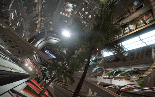
The other major factor is that the different stations don’t have very many functional distinctions, or at least not ones that are frequently visibly apparent. The game systems track which faction controls the station, what goods the station produces and buys, if there’s a civil war or other crisis going on, and if the station has a black market, but most of these factors don’t have an obvious visual cue.
It is wrong to say that gameplay and systems are the only thing that matters in a game: after all, you can only experience the game systems through the mediation of the interface, narrative, and visual elements. But that doesn’t mean that the systems don’t matter. Here, the feel of the stations is very similar. While encountering the occasional palm-decked luxury station is special, the (thankfully fairly low friction) docking experiences are largely identical.
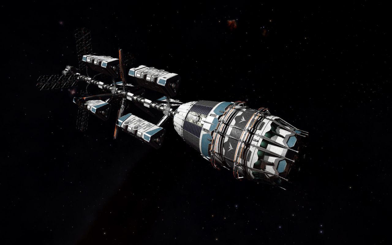
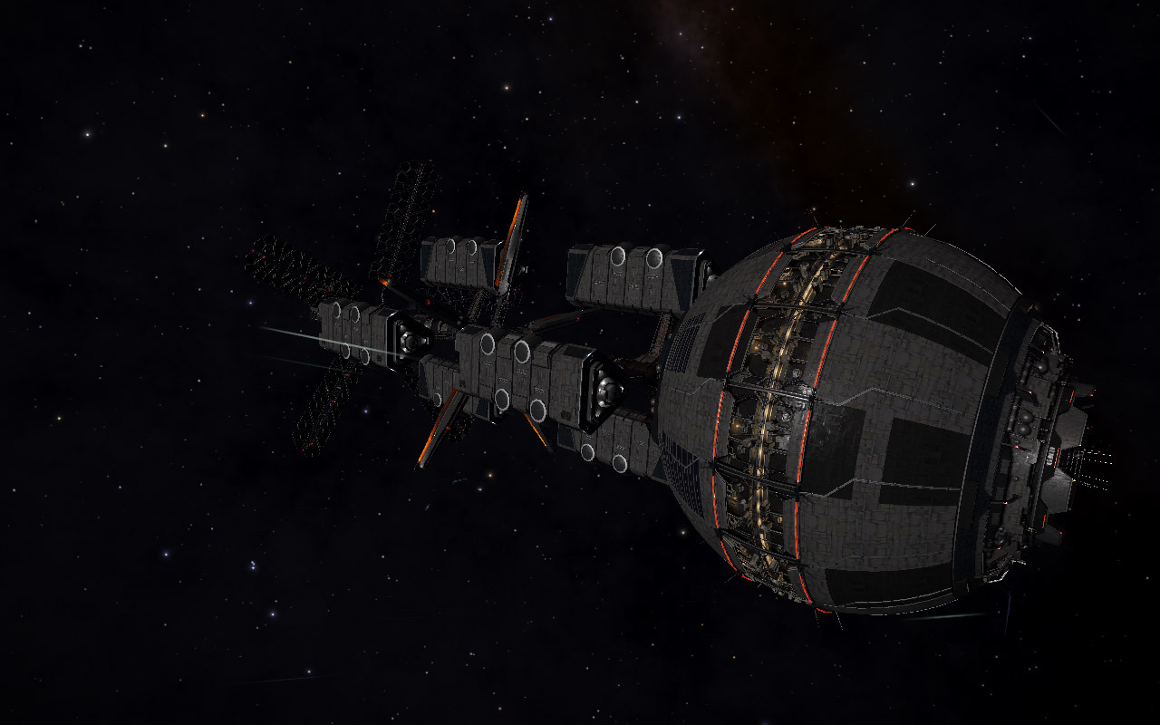
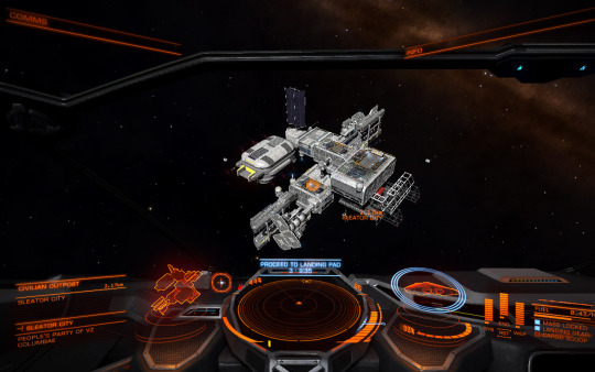
The smaller outpost stations also come in many modular configurations, though again, the functional distinction isn’t significant. Here, though, instead of being too much order, the outposts have too little: with no clear silhouette, they come across as random conglomerations of parts, which the players don’t have a huge incentive to explore. Too much chaos, not quite enough hidden detail.
I should note that it appears that Elite’s developers are in this for sustainable development over the long haul, which I find to be an exciting approach to game development simply because gradual development aimed at fulfilling a vision for a game over time is, to my mind, a better model for both the developers–who get steady work on a good project–and the players–who get more investment into a game that they already enjoy.
So, while I have things to criticise about the state of the game’s procedurally generated stations, I’m not going to say that the team made the wrong call. Sometimes you have to make the hard decision to cut back on a feature. While I’d love it if this aspect of the procedural generation was more deeply integrated into the game’s interactions, it’s not important enough to hold back the entire game.
That’s a message I’d like all of you aspiring procedural generation creators to internalize: sometimes, procedural generation isn’t the most important thing. I have no shortage of enthusiasm for procedural generation, but I also enjoy things that aren’t procedurally generated at all. I think that’s key for any artist who hopes to master a tool: sometimes the hardest part to learn is when not to use it.
Though I do hope they develop the stations further in future updates.
